Amazon's design has remained almost entirely stagnant since its conception. While this could imply that Amazon's design is simple, I would argue that it is the opposite. Apple is simple, SnapChat is simple- Amazon's layout, comparable to a site like Reddit, is incredibly complicated. With multilayered steps and countless options at every turn, the buyer is easily overwhelmed by all that Amazon has to offer. In this way, Amazons great variety of goods coupled with its unique and innovative features come into conflict with the overwhelming design with which each page is laid out.
While each step in the process can be relatively straightforward for an experienced online shopper- perhaps those of a younger generation that have grown up with online retailers as their main source of goods- the countless buttons and different paths each page could take the buyer complicate the process beyond the abilities of individuals who have less experience in this realm, be them older or with less access to the internet.
However, the outdated design, reminiscent of AOL in the 1990s, could welcome an older audience who would be familiar with it. In this way, the website attracts younger individuals with its wide array of goods, low priced shipping, and countless options, while attracting older individuals with what would be, to them, a familiarly complicated design. Similarly, with the exception of 1-Click purchasing, there are little to no shortcuts on the website. Although this might seem like something that would make it more difficult for older individuals to enjoy Amazon, ultimately, younger people are more capable of actually benefitting from short cuts. While younger individuals can understand the intricacies of a website simply from experience in the current technical age, shortcuts and different mappings on a website could easily confuse someone of an older generation. In this way, having the individual go through the same steps every time they want to purchase something, the same steps they are so used to on Amazon since 1994, could feel familiar and manageable. If Amazon simplified its design, it could potentially only serve to complicated it for those individuals who are so used to the way that it has appeared for the last eighteen years.
For example, on certain pages of the website, Amazon will offer the potential buyer recommendations for certain products. The generations of individuals that have experienced this sort of technology- that of directed advertisements on Google, recommended music on iTunes and Spotify, and suggested friends on Facebook- understand that recommendations made by websites are based on what the individual has done on the website before. Search history on Google, previously purchased songs on iTunes, and current friends on Facebook are all taken into account to make these recommendations. Although there are privacy concerns with directed advertising, individuals in my generation are aware of the way that these are created by different websites and applications through certain algorithms and groupings of products. On Amazon's website, above this section it says, "Inspired by Your Browsing History." In many ways, it is abundantly clear that recommendations that Amazon is providing would be based on browsing history. However, this section resembles the rest of Amazon's outdated design in that it targets an older audience that needs to have explained why certain things might be recommended to them. Amazon has to be overly straightforward and overly clear with its explanations in order to appeal to all audiences, even those that have less exposure to technology.
This photo essay displays the process by which a customer can purchase a product on Amazon. The enormous number of visual stimuli ask the question of Amazon's design strategy. While on the one hand these stimuli overly complicate the process, they also could make older generations more comfortable using a technology that seems unchanged in a time where everything is advancing at an uncontrollably rapid rate. This photo essay asks whether customers favor familiarity over innovation when convenience is a priority. That is, when a customer wants an easy shopping experience, is it familiarity with a certain process, or innovation in the form of shortcuts and limiting of information that will ultimately attract them to Amazon over other websites?
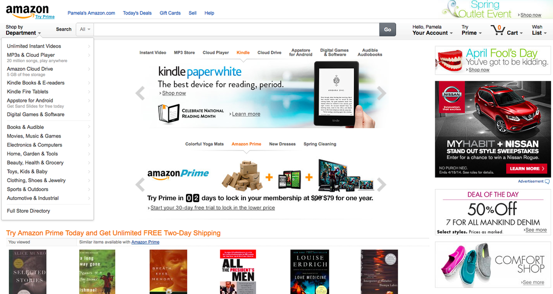
Amazon's homepage. The search bar is likely longer than the title of all products on the page. However, to show the affordances of the website, the search bar is over-emphasized.
The shopper is encouraged to try Amazon Prime at least four times just on the first page.
Additionally, the home page clearly shows Amazon's focus on books, the first items they sold in 1994. However, advertisements on the side of the page show deals for cars, shoes, and jeans, as well as special events like the "Spring Outlet Event."
On the left of the page is a list of some of the departments within the online store.
In order to showcase the process, I decided to act as a shopper looking for a new book to read. I first click on the "Shop by Department" button on the top left of the screen.
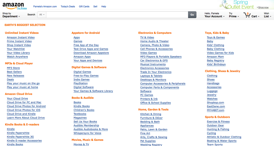
This page, displaying departments and their subsections is a simple dual colored list in four columns. At the top left of the page Amazon boasts that it has "Earth's Biggest Selection." This is an obvious positive of shopping on Amazon- the ability to find anything you need is essential in an online retailer like Amazon that hopes to dominate the market.
The simplicity of the design also attracts a user that could be easily confused. The traditional appearance of the page is reminiscent of an older time on the internet.
From this page I clicked "Books."
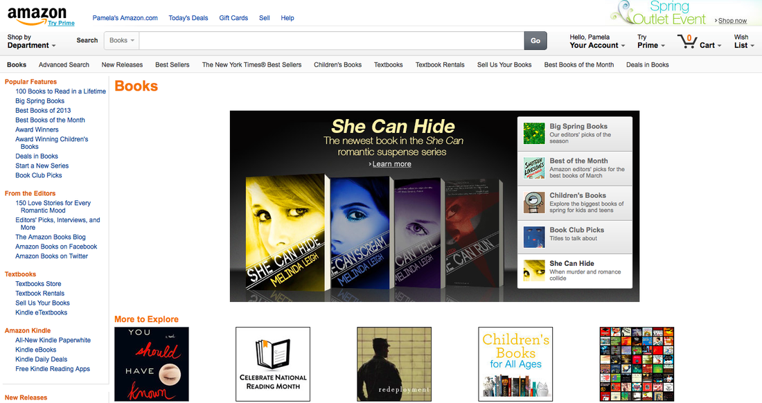
The Books page of Amazon is the oldest as it was the foundation of the website in 1994. From there, Amazon expanded to all of its other departments in the last eighteen years.
At the top of the page there are links to different categories of books including "New Releases," "Children's Books," and "Textbooks," along with several others. In the center of the image is a recommended book series that is currently being featured. On the leftmost side of the page are more categories of books, including categories created by Amazon itself, like "150 Love Stories for Every Romantic Mood." Additionally there is a section for the Kindle which is an Amazon tablet designed for downloading and reading many books all on one device.
Lastly, the same Amazon Prime advertisements are also present on this page, along with each one throughout the website.
In order to find a book I might like to read, I go to "100 Books to Read in a Lifetime."
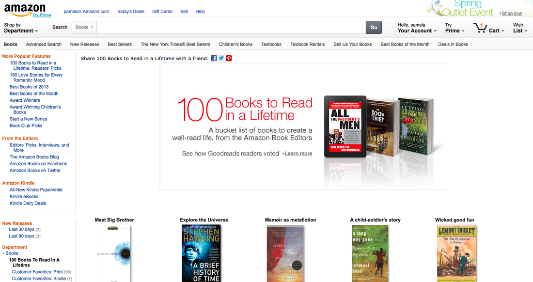
This is the "100 Books to Read in a Lifetime" page, created by individuals behind the scenes at Amazon who have deemed these books as a central 100. The page allows the customer to share the list with "a friend" via Facebook, Twitter, and Pinterest with the click of a button. From this page, I chose to look at the child-soldier's story, "A Long Way Gone" by clicking on the book's cover.
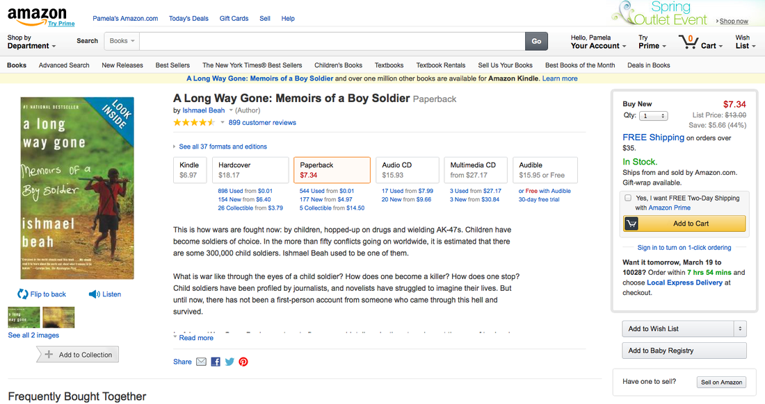
This product page shows The cover of the book, a list of different forms in which the reader can receive the book (Kindle, Hardcover, Paperback, Audio CD, Multimedia CD, Audible), a synopsis of the story, and a section of other books that are "Frequently Bought Together" with the current product. At the top of the page is the consistent Amazon tool bar so that the customer can quickly search for anything they may be inspired to buy. To the right of the page is the area which lists the price, quantity, and some shipping information, as well as yet another plug for Amazon Prime. A large yellow button amidst a white page clearly shows where the customer should click to be able to purchase the book.
From here I chose to "Look Inside!"
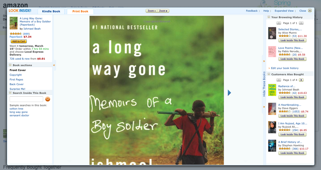
The ability to "Look Inside!" is clearly a mirroring of the in-person shopping experience. At a bookstore, an individual can look at the cover of a book and flip through its pages to decide whether or not to buy it. Amazon wouldn't want to limit its users to just the information that may be easiest to provide on an online/website forum.
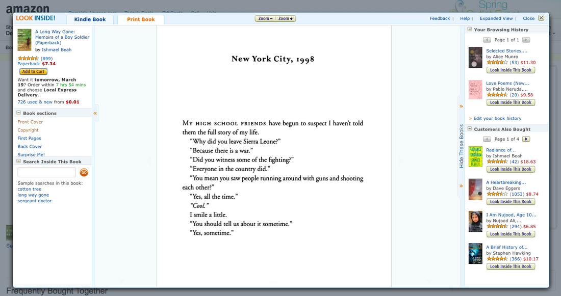
The customer can even read a few pages of the book, much like in a bookstore, to decide whether or not they want to purchase it.
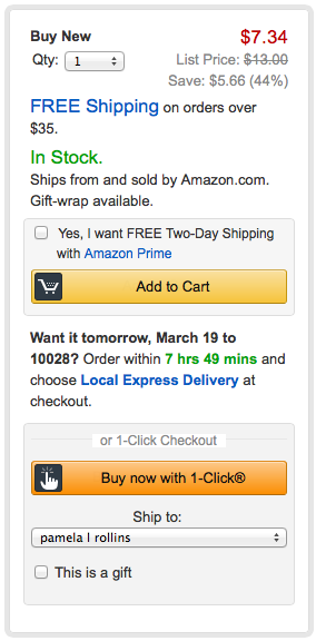
Back on the product page, the ability to purchase the product is dependent on this tool bar of options. The customer can decide on a quantity and can see the price. Furthermore, different shipping options complicate the tool bar.
First is the option for free shipping on orders over $35. There is also a plug for Amazon Prime as well as the option for 1-Click Checkout. I personally have clicked "Buy now with 1-Click" assuming that the click would not be the button on the page. I received a book I didn't mean to order because I wanted to explore what this button did or what 1-Click ordering was like. Furthermore, I sent the book to my mother instead of myself.
The complication of the ordering process is evident here. With many options and explanations of when to order such that the product can arrive at a certain time could easily confuse any shopper.
From here I clicked "Add to Cart."
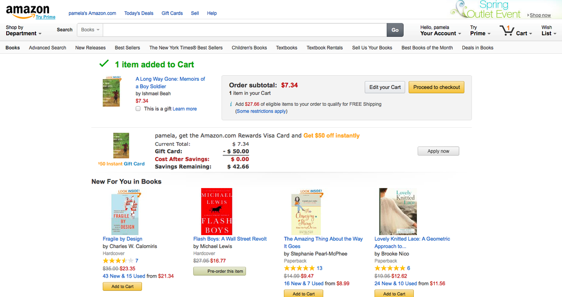
On this page, there is the option to continue shopping, to look at other recommended books, or to register for an Amazon.com Rewards Visa Card. On each page Amazon is attempting to sell the customers different products, connected to Amazon or not.
I clicked "Proceed to Checkout," a yellow button that, again, stands out against Amazon's traditional white background.
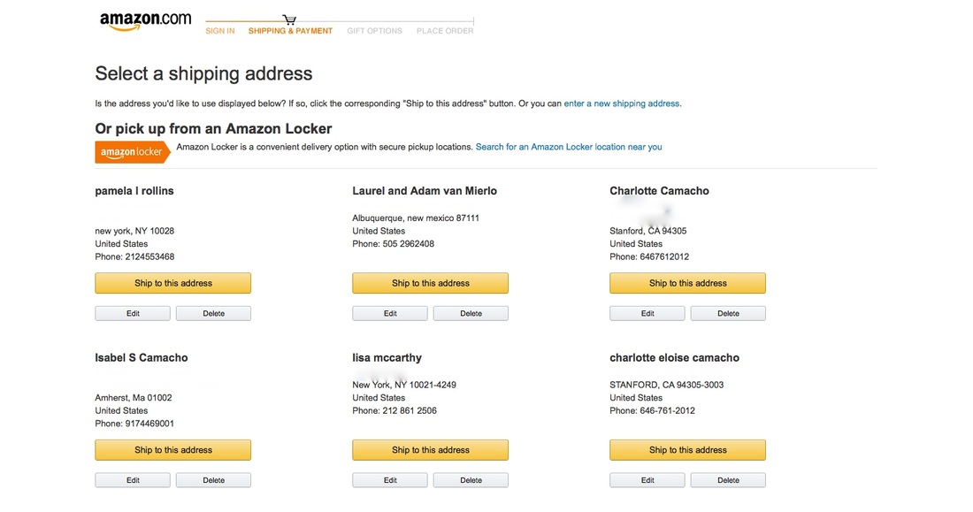
This page is actually the most straightforward, I believe, of the website. Amazon stores previously used shipping addresses and allows you to pick one from those listed on this page. This allows the customer to send it to themselves or friends/family without having to enter the address every time they purchase something on the website.
Simultaneously, by making it easier for the consumer, they can move through the ordering process instead of changing their mind at any point. This is the only page in the ordering process that I believe streamlines the process.
For the sake of this example, I selected that the book be sent to my address by clicking "Ship to this address" under my name.
Ship to this Address (Me, here)
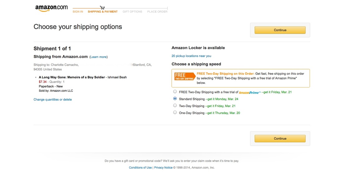
On this page the customer is given options for shipping. These options are simultaneously advertisements. Amazon plugs its Amazon Locker and Amazon Prime yet again.
I clicked "Continue."
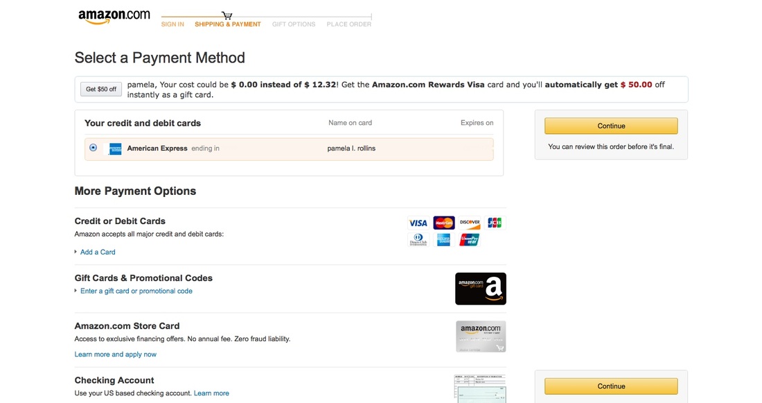
This page, also a more streamline aspect of the process, allows the customer to select a credit card that they've already used on Amazon in order to make this purchase so that they don't have to reenter information about the card or a billing address.
I clicked "Continue" because I already have a card n the account.
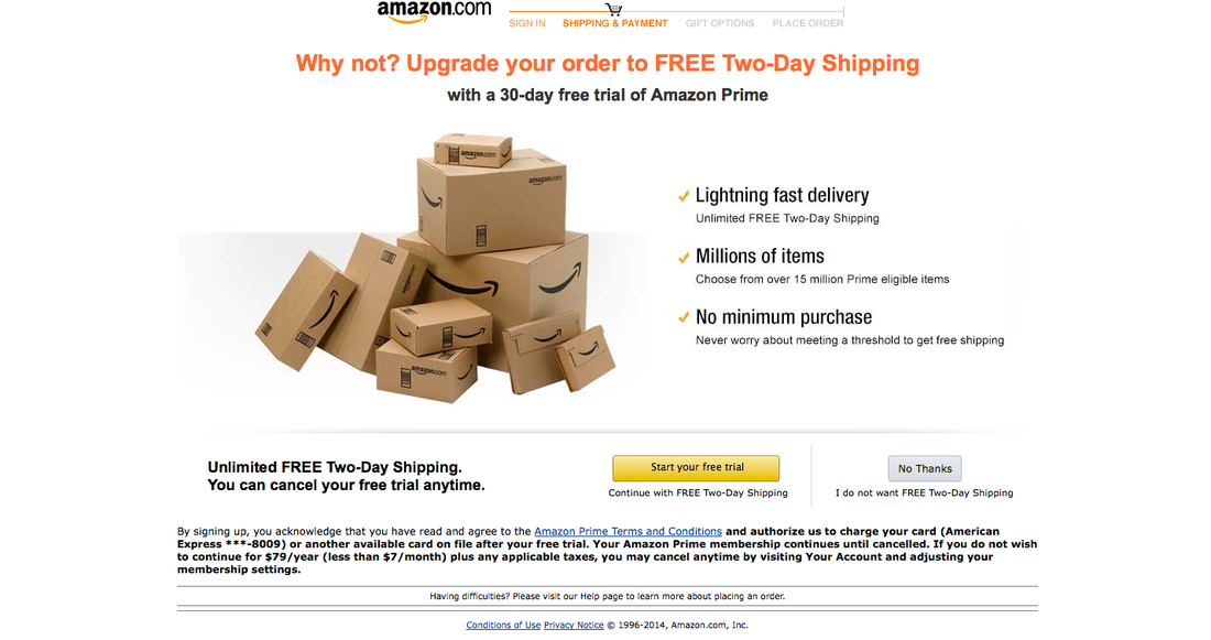
This entire page is an advertisement for Amazon Prime. While throughout the entire process a yellow button has been the button to press in order to move along in the process, Amazon uses a yellow button to trick the customer into thinking that Amazon Prime is simply a part of the process. However, it is actually the grey button to the right that says "No Thanks" that allows the customer to buy the seven dollar book without spending an extra $100 for Amazon Prime.
I clicked "No Thanks."
No thanks
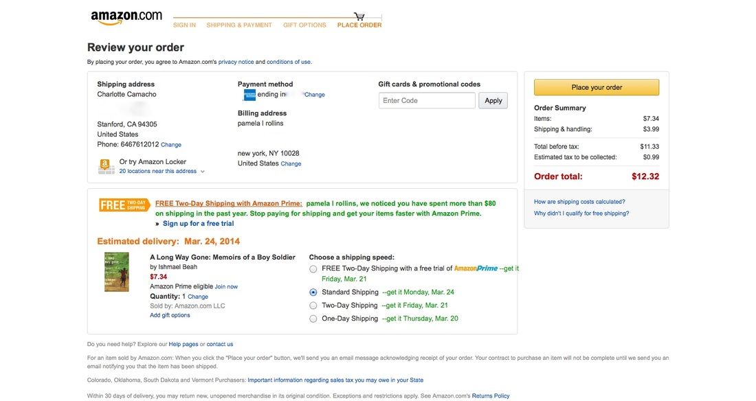
This last page finally allows the user to place their order with a final plug for Amazon prime.
